Take Action and Explore on Jobs
The Jobs home has two rows that do the real work: **Take Action** and **Explore**. Take Action is where a job-level decision surfaces with a dollar figure attached, ready for you to open and work.…
On this page
What this page is
The Jobs home has two rows that do the real work: Take Action and Explore. Take Action is where a job-level decision surfaces with a dollar figure attached, ready for you to open and work. Explore is a row of tiles that each open one lens on your book of jobs, so you can go from the headline number straight into the detail behind it.
Verinode reads the jobs, invoices, supplements, and financials you already have, finds what is worth your attention, and recommends how to act on it. It never acts on a job for you. You open the decision, you decide, and you act.
For the rest of the Jobs page, the hero band and the tabs behind each tile, see Jobs overview and Jobs detail tabs.
Where to find it
Open Jobs from the sidebar. Below the hero band at the top of the page, the rows stack in order:
- Apps, the section's standing tools (see the Apps row).
- Take Action, the decision row.
- Explore, the seven lens tiles.
- Capture by person, when you have two or more comparable people (see Capture by project manager).
- Recent activity, the jobs something happened to most recently, as tiles.
Each row scrolls sideways. Drag it, or use the arrows on the right, to see every tile.
The Take Action row
Take Action carries decisions only. The Ask IQ tile and the unlock tile that used to open this row now live in the Apps row above it, alongside the section's launchers, so this row holds nothing but what Verinode has found. See the Apps row for those tiles.
The post-mortem tile. When Verinode finds one recent job that ran clearly under your own numbers, a Post-Mortem tile leads the row. It names the job in plain words ("the Maple Street water job"), leads with the dollar gap ("$4.2k below your usual"), and states the basis in the same breath: the job ran a stated number of points under your own median for that kind of work, across your comparable jobs. The baseline is always your own book, never an industry figure. Its Walk it with IQ action opens the analysis. The tile appears only when there is a genuine candidate, which is rare by design; the standing invitation to run a post-mortem yourself, including on a book that has produced no candidate, lives in the Job Performance deck in the Apps row.
The decision tiles. These are the point of the row. Each one is a single job-level decision Verinode has surfaced and is recommending you act on. A tile carries:
- A Recommended eyebrow.
- A headline dollar figure, the impact on the table, tagged /mo for a monthly figure or with the matching period for an annual or one-time figure. When a decision has no dollar figure yet, the headline is the plain-language name of the finding instead.
- A context line naming what the figure is about, so the number is never floating without a subject.
- The entity it concerns with its logo, a row of lifecycle dots showing how far along the decision is, and a trajectory label (Improving, Stable, or Declining) with an arrow.
Only decisions that are still pending or snoozed show here. Once you have acted on or resolved a decision, it lives in the decisions workspace instead.
Note
The peer context on these tiles reads vs Peer when you contribute data and a cohort has formed, and vs Industry otherwise. On the Contributor (free) tier the network's peer numbers are held back, and drafting an action plan draws on your Intelligence Units. The layout and reasoning stay fully visible either way.
Clicking a decision opens the workspace
Click any decision tile and the decision workspace opens as a glass overlay on top of the Jobs page. That is where you read the full reasoning, see your position against peers, press Act to have IQ draft a concrete plan, and later record whether it worked. When you open a decision from this row, the overlay knows the set and lets you step through the other open decisions with the arrows or arrow keys. The workspace is the same surface no matter where a decision first appears, so a job decision has one home. See The decision workspace for the full walk-through.
When the row is empty
The row shows one of four honest states depending on where you are:
- While it loads, three placeholder tiles pulse.
- No jobs yet. A "Get jobs flowing in" card gives you three quick moves: upload a job export or estimate PDF, forward your last claim email, or paste an invoice or supplement. Decisions surface as jobs flow through billing and collection.
- You have worked through everything. A "No open decisions on your jobs" card notes how many signals you have already resolved. New ones surface as jobs progress.
- Still learning. A "Still learning your operation" card, shown while your agent is analyzing jobs, clients, and cash flow before the first decisions land.
The Explore row
Explore is seven metric tiles. Each shows a headline number and a small inline chart, and each opens one lens on your jobs when you click it. The number is a summary; the tile behind it is the detail.
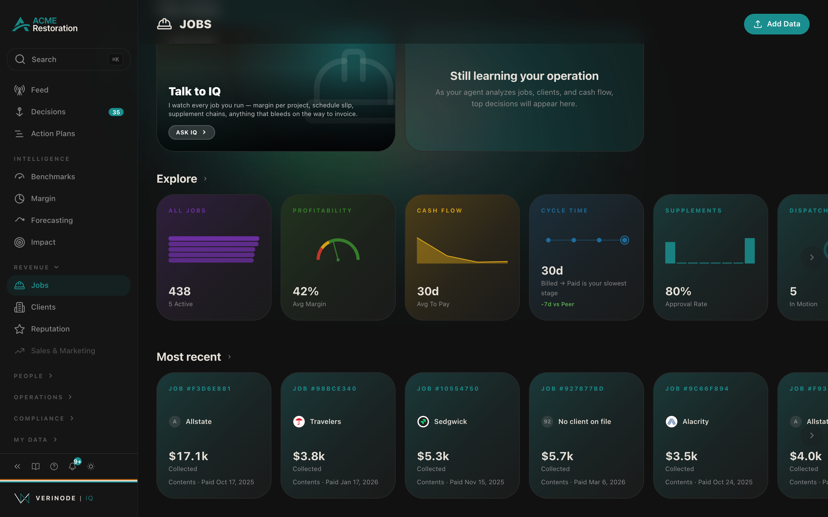
- 1All Jobs (violet). Headline is your total job count, with the active count beneath it. The chart previews collection rate by carrier. Opens the All Jobs view, a list of every job with Total Jobs, Active, Total Billed, and Collection Rate across the top.
- 2Profitability (green). Headline is your average margin, shown as a gauge. Opens the Profitability view, which reads Avg Margin, Revenue Leakage, Total Collected, and Avg Days to Pay. See Understanding your margin for how margin is built.
- 3Cash Flow (amber). Headline is your average days to pay, with a sparkline of your receivables aging. Opens the Cash Flow view, which reads Billed Unpaid, Predicted 30-day inflow, Avg Days to Pay, and Cost of Carry.
- 4Cycle Time (steel). Headline is the median days stuck in your slowest stage, with that stage named beneath it, for example "Billed to Paid is your slowest stage." The chart marks where in the lifecycle the flow stalls. When there are not enough job dates yet, it reads "Add job dates to map your flow." Opens into the Cash Flow view.
- 5Supplements (teal). Headline is your supplement approval rate, reading "approval rate" or "over-approved." Opens the Supplements view, which reads Total Supplements, Approval Rate, Avg Recovery, and Total Approved.
- 6Dispatch (copper). Headline is your active job count, "in motion," shown as a ring of the share of your portfolio currently active. Opens the dispatch board inside the All Jobs view.
- 7By Type (steel). Headline is the number of job types in your book, "job types vs peers," with a bar per type. Opens the By Type view.
The Cycle Time and By Type tiles carry a vs Peer line when a cohort has formed for that comparison, and stay operator-only otherwise rather than showing a hollow number.
Best-practice flow
Start at Take Action. If a decision reads, say, "$1.2k/mo" against a carrier with a declining trajectory, open it, read the synthesis, and press Act to get a plan. If Take Action is quiet, move to Explore: open the tile whose number looks off, read the four stats behind it, and click into the jobs driving it. A decision you work here can be saved as a repeatable process from inside the workspace, so a one-off fix becomes the way your business runs.
Data sources
Data sources
- 1.Your jobs, invoices, supplements, and financials. Your business.
- 2.Anonymized peer benchmarks and decision paths. Verinode network.
- 3.Verinode Research reports and standards. Verinode Research.