Understanding your margin
How Verinode reads your margin, why it leads with net income, and how to see what is moving it.
On this page
- What the Margin page is for
- 1. Money & Health (the two gauges)
- 2. The Number (your headline margin)
- 3. Trend
- 4. Take Action
- 5. Explore — the nine tiles
- The detail views (what opens when you click a tile)
- What to upload to fill each part
- How Margin connects to the rest of Verinode
- Reading the confidence dots
- Best-practice workflow
- Data sources
What the Margin page is for
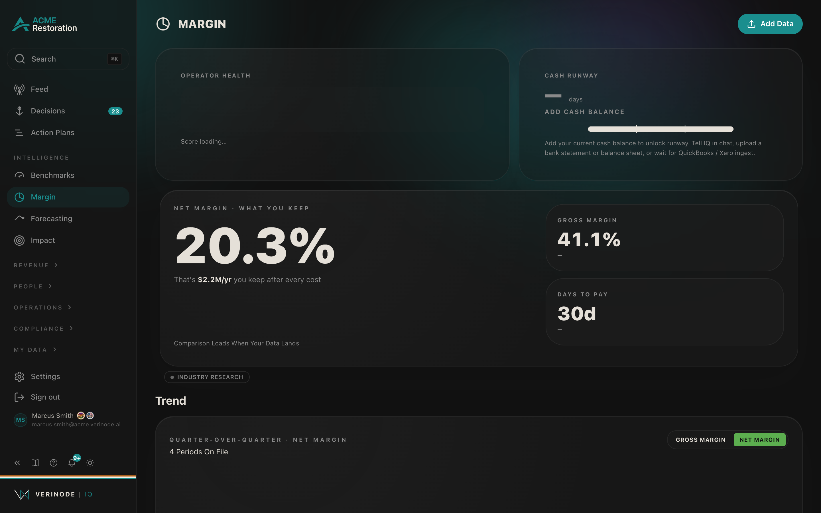
The Margin page answers one question: for every dollar of work you do, how much do you actually keep, and where is the rest going? It pulls your P&L, job costs, payroll, supplement chains, and cash position into one view, positions each number against your peers, and turns the gaps into decisions you can act on.
Almost everything on the page is a doorway: the headline numbers summarize, and clicking any tile opens a detail view with the full breakdown. This article walks the page top to bottom, explains every tile and number, and lists exactly what to upload to fill each one in.
Open it from the left sidebar under Intelligence → Margin, or go to iq.verinode.ai/margin. The Add Data button in the top-right is how you feed the page.
Note
You do not have to add everything at once. Each part fills in independently the moment its data lands, and every tile tells you exactly what it is waiting for.
How Margin connects to the rest of Verinode
Margin is a hub, and many of its numbers are computed by joining data across sections:
- Labor and Wages join your Team payroll with job hours and revenue; the wage comparison uses the same published market brackets as the Team page.
- Stack Spend comes from your Vendors relationships.
- Adjusters, Carriers, and Pricing come from your Clients and Carriers plus the supplement chains in your inbox. Per-client profitability itself lives on Clients.
- Leakage and Cash Flow draw on your Jobs (billed versus collected) and invoices.
- The Benchmarks tab is a slice of the full Benchmarks page.
- Operator Health is the same 8-dimension score you see elsewhere in the platform.
So if a margin number looks off, the underlying detail is usually one click away, or in the section that feeds it.
Reading the confidence dots
Most tiles carry a small confidence dot. It reflects how much real data stands behind the number: a strong dot means a full P&L, a thick peer cohort, or a well-tracked history; a weaker dot means Verinode is working from partial data or an industry fallback rather than your own peers. Trust the strong ones for decisions, and treat the weak ones as directional until more data lands.
Best-practice workflow
- 1Start with The Number and the Net Margin tile: are you keeping a healthy share, and how do you compare to peers?
- 2If you are behind, open Cost Structure to see which layer (COGS or overhead) takes the most, then Labor and Leakage to find the specific driver.
- 3Check Cash Runway: runway is often the more urgent number even when margin looks fine. If it is empty, add a bank statement first.
- 4Work the Take Action row top to bottom: click Take Action on the highest-impact decision and follow the drafted plan.
- 5Re-check the Trend after a few weeks to confirm the number is moving.
Data sources
Data sources
- 1.Your P&L, job-costing reports, payroll, and line items. Your business.
- 2.Connected accounting systems and bank statements. Your business.
- 3.Supplement-chain emails forwarded to your Verinode inbox. Your business.
- 4.Anonymized peer benchmarks and cohort medians. Verinode network.
- 5.Published industry benchmarks (RIA, SOTI 2026). Verinode Research.