The Jobs detail tabs
The Jobs page opens as a row of Explore tiles. Tap any tile and a full-screen glass slider opens with six tabs across the top. Each tab is a different lens on the same job book: the decisions your…
On this page
The six detail tabs
The Jobs page opens as a row of Explore tiles. Tap any tile and a full-screen glass slider opens with six tabs across the top. Each tab is a different lens on the same job book: the decisions your agent has surfaced, the raw list, where the money leaks between estimate and cash, how each carrier treats your supplements, what is stuck in accounts receivable, and how your work breaks down by peril type against peers.
The tabs are, left to right: Findings, All Jobs, Profitability, Supplements, Cash Flow, and By Type. Every number in these tabs is read from the job records you have already imported. Verinode does not decide anything for you here. It lays out the read plainly, and the call stays yours.
If you have not yet seen how jobs land on the platform, start with the Jobs overview. For the single-job drill-in that opens when you tap a row, see the job profile. Several of these tabs summarize the same underlying data that the dedicated Margin page treats as a full profit-and-loss surface; where the two overlap and where they differ is called out below.
Note
Any peer comparison you see in these tabs (only the By Type tab carries one) is drawn against an anonymized cohort and only appears once that cohort clears a minimum size. Your job data is pooled into anonymized benchmarks and is never sold to carriers. That independence is the reason the peer number is worth trusting.
Findings
The first tab is the decision gallery. It shows the patterns your agent has already found across the job book, one tile per decision, under an eyebrow that reads "N decisions to review" (or "1 decision to review" for a single one).
Each tile is a compact square card carrying the finding's headline. Tap a tile and it opens the decision drill-in inside the same slider, where you can swipe left and right between findings without leaving the tab. This is the same Findings surface that every section carries (vendors, equipment, clients), so it reads and behaves identically wherever you meet it.
Empty state. When there is nothing to act on, the tab reads "No decisions for jobs right now. As your agent finds patterns, they'll appear here." That is normal on a fresh or quiet book, not a broken screen. Findings accrue as data flows in and the agent has enough signal to say something.
All Jobs
This is the working list: every job, with a filter bar on top and three ways to view it.
The filter bar. Across the top you get a search box ("Search jobs…", which matches on claim number, client name, and carrier name) and five dropdowns:
- Time preset, All time, Last 30 days, Last 90 days, Year to date, Last 12 months.
- Year, only years that actually have jobs, newest first.
- Month, January through December.
- Category, built from the categories present in your own data, so the list follows your taxonomy rather than a fixed enum.
- Status, Active, Completed, Billed, Paid, Closed, Archived (archived jobs are hidden until you pick this).
The date filters all operate on the job start date, meaning the date the job was assigned, falling back to when the record was created. When any filter is active, a small line reads "X of Y jobs" so you can see the filter's impact at a glance. Filters are written into the page URL, so a filtered view survives a refresh and can be shared or bookmarked. There is also an Export PDF button for the current view.
Three views. A toggle switches between:
- Cards, album-art tiles. Each shows the category label, a status pill, the claim title, the client or carrier logo and name, the primary dollar amount with its label (Collected, Billed, Approved, or Estimated, whichever is furthest along the lifecycle), a rough margin percentage and days-to-pay when known, a row of lifecycle dots, and one contextual flag pill. The flag surfaces the single most important thing about the job: a dollar gap between estimate and approval (green if approved came in higher, red if lower), an unpaid-days count when a billed job has sat past 30 days, or a supplement state (Supp approved / Supp pending).
- Table, a dense, scrollable grid with columns Job / Claim, Client, Category, Lifecycle, Amount, and Days to Pay. The Lifecycle column can also show a small SLA pill when a job is at risk or has breached its on-site or cycle-time target. Days to Pay is color-coded: neutral under 30 days, amber past 30, red past 45. The table is virtualized, so it stays smooth even at several hundred jobs.
- Calendar, the same filtered jobs laid out by date.
Tapping any card or row opens that job's profile.
Empty state. With no jobs at all, this tab shows an import zone ("Import Job Data", "Drop a CSV export from your ERP, estimating tool, or any job list.") alongside a preview of the intelligence that will appear once data flows in. If your filters simply match nothing, it reads "No jobs match your filters" with a Clear filters action.
Profitability
This tab visualizes where revenue moves and leaks across the whole book, in three stacked illustrations.
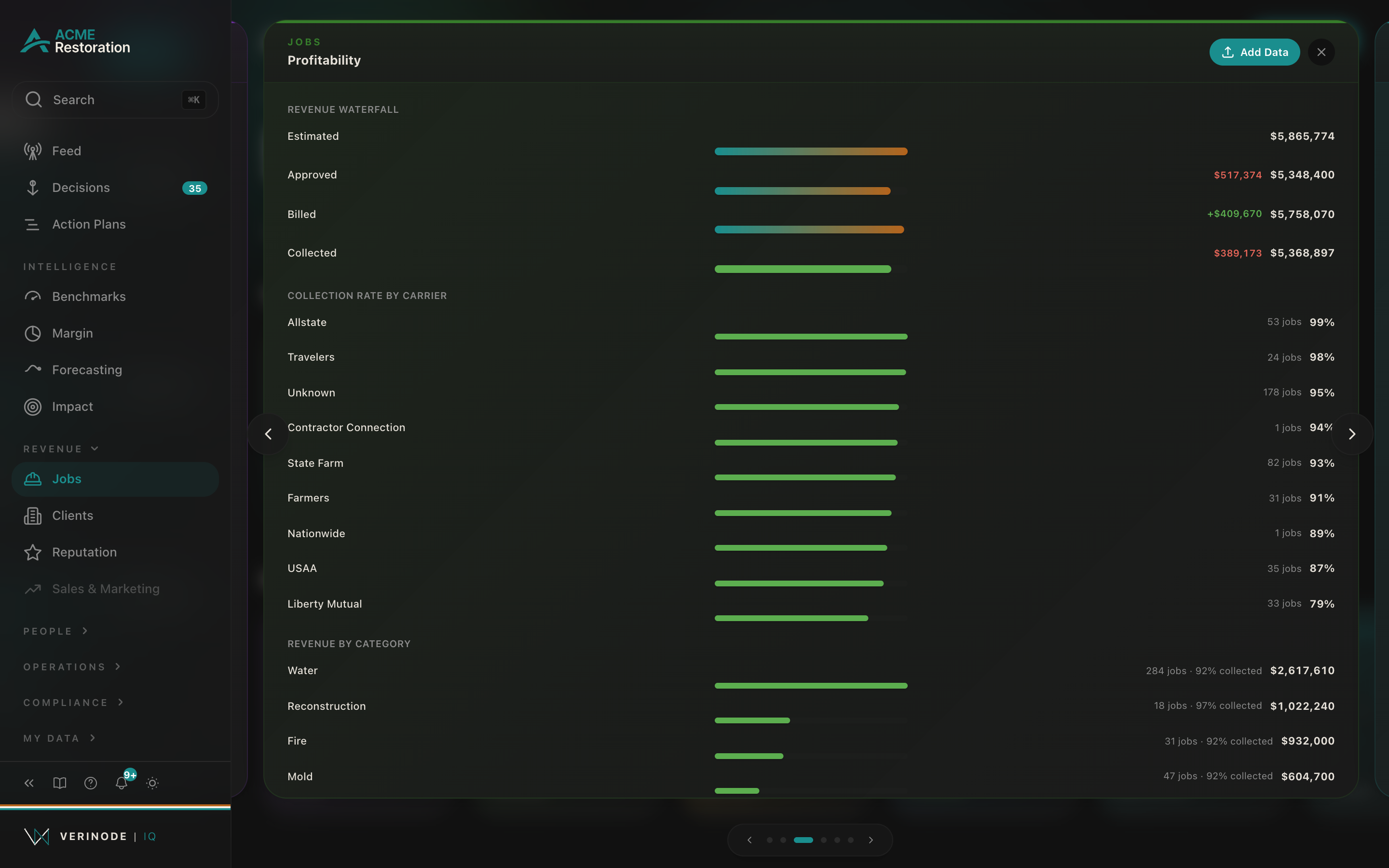
- Revenue Waterfall, four steps, Estimated → Approved → Billed → Collected, each with its total and the delta from the previous step (green when the step gained, red when it lost). This is the clearest picture of where dollars fall out of the pipeline: a big drop from Estimated to Approved is carrier pushback on your estimates, a drop from Billed to Collected is money you earned but have not been paid. Steps with no dollars are omitted, so a book that has not billed yet shows a shorter waterfall.
- Collection Rate by Carrier, a horizontal bar per carrier showing what share of billed revenue you have actually collected from them, sorted best to worst, with the job count beside each. Top ten carriers by collection rate.
- Revenue by Category, a horizontal bar per category showing total revenue, with a secondary line noting the job count and the collected share for that category.
Note
This tab is a revenue-and-collections view, not a true profit read. It works from estimate, approval, billed, and collected dollars on your job records. It does not carry labor burden, materials cost, or net income. For burdened margin, net income, the confidence panel, and the margin trend over time, use the dedicated Margin page. Think of this tab as "where does revenue leak in the pipeline" and the Margin page as "what did we actually keep."
Empty state. With no jobs, the tab reads "Profitability analysis pending" and "Import job data with financial fields to unlock margin intelligence." The waterfall and bars only draw once the relevant dollar fields are present, so a book with jobs but no financials shows fewer illustrations.
Supplements
This tab pairs the filtered job list with a carrier-by-carrier breakdown of supplement behavior. The list at the top is the standard All Jobs list, narrowed to jobs that carry at least one supplement, with the same filters and views.
Below it sits the supplement-by-carrier table. Carriers are named here on purpose: you negotiate supplements against named counterparties, so the table names them and lets you sort on any column. Columns:
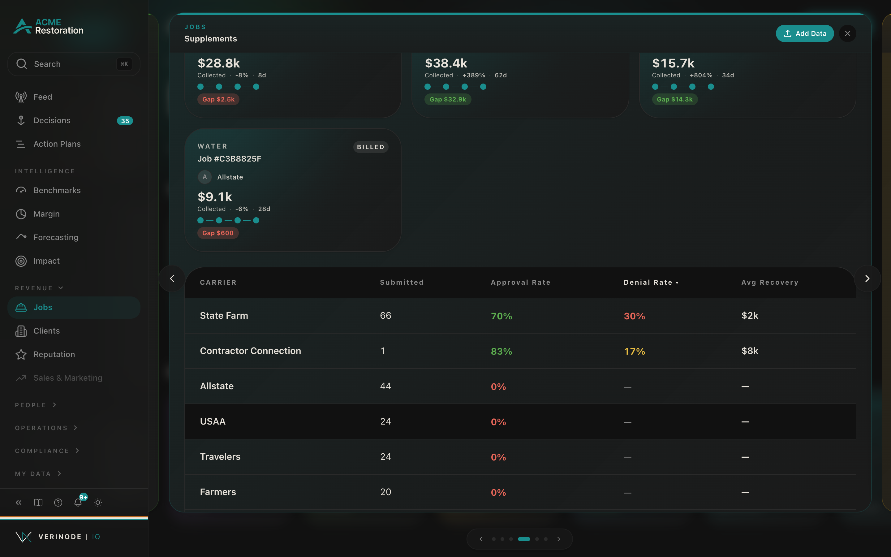
- Carrier, the carrier name.
- Submitted, how many supplements you have submitted to them.
- Approval Rate, the share they approved, color-coded as a reading aid: green when strong (roughly 70 percent and up), amber in the middle, red when low.
- Denial Rate, the share they denied, colored the other way (red when high, around 25 percent and up; amber in the middle; green when low). A dash means there is no denial signal yet for that carrier, which is different from a zero.
- Avg Recovery, the average dollar amount you recover per approved supplement with them.
The table defaults to sorting by denial rate, highest first, so the carriers pushing back hardest sit at the top. Tap any column header to re-sort; tap again to flip the direction.
Empty state. With no supplement data, the table reads "Supplement intelligence pending" and "Include supplement data in your job import to unlock carrier-specific supplement analytics."
Cash Flow
This tab answers "what is stuck in accounts receivable, and what is it costing me." Like the Supplements tab, it pairs the job list (here narrowed to jobs that are billed but not yet paid) with a dedicated panel below.
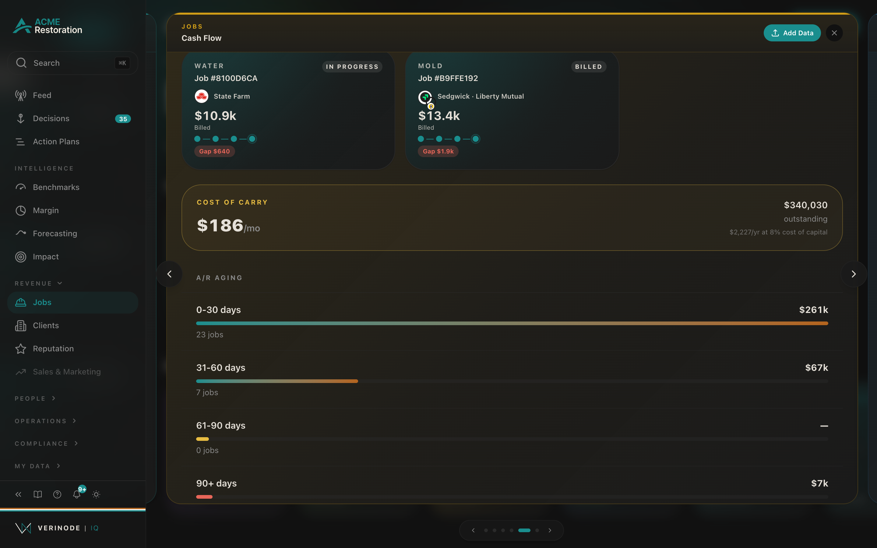
The panel has two parts:
- Cost of Carry, a callout showing what your outstanding receivables cost you to float. The large figure is the monthly carry, with the total outstanding balance and the annual figure beside it, noted as calculated at an 8 percent cost of capital. This is the quiet, ongoing cost of money you have earned but not collected.
- A/R Aging, four buckets, 0-30 days, 31-60 days, 61-90 days, and 90+ days, each showing the outstanding dollars and the number of jobs sitting in that age band, with a bar scaled to the largest bucket. The oldest bucket (90+) is drawn in red and the 61-90 band in amber, so the receivables slipping out of reach stand out. Aging is measured from the billed date.
Heads up
The 90+ bucket is where collections quietly die. A dollar that ages past 90 days is far harder to recover than one at 30, and it is carrying cost the whole way. Work the aging table oldest-first.
Empty state. Without billing and payment dates, the panel reads "Cash flow prediction pending" and "Include billing and payment dates in your job import to unlock cash flow predictions."
The cost-of-carry number here is the same idea the cash flow and runway article treats in full: that article explains how the figure is built and how it feeds your runway. This tab is the job-level view of the receivables behind it.
By Type
The last tab breaks your work down by peril type (water, fire, mold, and so on) and, for each type, sets your own number next to the peer cohort doing that exact kind of work.
Your Jobs by Type. At the top, an instant composition: one row per peril type with a bar sized to your job count and the count beside it, ordered by volume. This renders immediately from the jobs already loaded, with no wait.
The metric toggle. A row of chips lets you pick which metric to compare on: Burdened Margin, Days to Pay, Collection Rate, Time to On-Site, and Cycle Time. Switching chips re-slices the comparison instantly.
Per-type comparison. Below the toggle, each of your peril types gets a You figure and a Peer cohort figure side by side, with a colored delta line (green when you are ahead for that metric, red when behind) and a short transparency line. Your side notes how many of your jobs stand behind the number, so a one or two-job average is never mistaken for a stable read. The peer side notes how many operators are in the cohort.
Note
This is the one Jobs tab with a live peer comparison, so the anonymity floor matters here. On a thin peril type where the cohort has not cleared the minimum size, the peer side shows a dash and the transparency line explains why, rather than showing a number that could be traced to a single operator. That gate is qualitative by design: it protects the pool, and it is the reason the comparisons you do see are trustworthy.
Empty state. Before any jobs are classified into peril types, the tab reads "No classified job types yet. As jobs are ingested and tagged, your work breaks down by type here."
Best-practice example
Say collections feel slow this month. Open the Jobs slider and start on Cash Flow: the A/R Aging table shows a heavy 90+ bucket with several jobs stuck there, and the Cost of Carry callout puts a monthly figure on what that pile is costing you to float. You switch to Supplements to see if a carrier is the common thread, sort by denial rate, and find one carrier denying far more than the rest. You jump to Profitability and the Revenue Waterfall confirms a real gap between Billed and Collected concentrated in that carrier's Collection Rate bar. Finally you open All Jobs, search that carrier, and work the unpaid list oldest-first. Four tabs, one story: Verinode laid out where the money is stuck and who is behind it; the decision to chase it is yours.
Getting the most from the tabs
- 1Start on Findings to see what your agent already flagged before you go digging.
- 2Use All Jobs as your working list: filter by time, category, or status, and switch to the table view when you want density.
- 3Read Profitability for the pipeline leak, then open the Margin page when you need true burdened margin and net income.
- 4Work Cash Flow oldest-first, and pair Supplements with the adjuster scorecards to see which carriers cause the drag.
- 5Use By Type to check whether a weak metric is your whole book or just one kind of work, and read your number against the peer cohort where the cohort is deep enough to show one.
Data sources
- 1.Your imported job records (estimate, approval, billed, collected, dates). Your business.
- 2.Your supplement submissions and carrier outcomes. Your business.
- 3.Anonymized peer cohort by peril type (By Type tab). Verinode network.
- 4.Decisions surfaced by your agent. Verinode.